
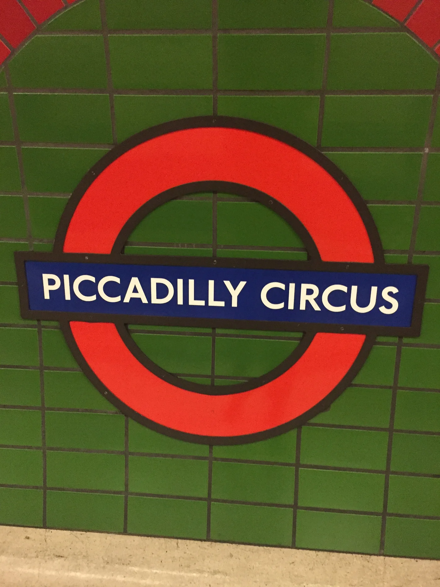
The short answer
The lettering on an Underground station sign had to do two things at once. It had to spell out the place accurately and give riders a familiar cue that they were reading transport information. In 1913 Frank Pick commissioned Edward Johnston to design new lettering for the Underground. The first version was delivered in 1916, and it became part of a system that reached beyond a single poster or station.
Reading the network
How repeatable lettering works
The same alphabet can identify the organisation even when the words, layout and size change.
| Application | Immediate task | Benefit of repetition |
|---|---|---|
| Station name | Tell passengers where they are | The lettering acts as a recurring cue on different platforms. |
| Directions | Identify a route, exit or destination | The same letter shapes work across changing messages. |
| Printed information | Explain travel before the passenger boards | Printed and station material can share an identifiable voice. |
Chronology
A timeline of the turning points
The Underground commissions Johnston
Pick commissions a coordinated family of Underground lettering.
The first version arrives
The delivery gives the Underground a shared typeface for its information.
The letters are adapted
Changes for later production and use carry the tradition forward.
A commission for repeated use
Pick held responsibilities that put him in a position to bring different parts of the Underground’s public presentation together. The museum’s collection of his records places design alongside his work on passenger information. Johnston was a calligrapher, and the commission called for a lettering system that others could put to work. Delivering an alphabet in 1916 gave printers and sign-makers a set of forms that could spell any station name the network needed.
From a station name to a direction
The station design guide reproduces lettering in use at Earl’s Court by about 1937. The messages on the signs direct passengers to a place or a route, and their different words need to be read at a glance. Using familiar forms aids recognition every time the next message changes. The alphabet, the wording and the placement of the sign still do separate jobs. A readable name can be placed too late for a traveller to choose a stairway.
Why the date matters
The 1916 version belonged to a particular production era. TfL notes that the original type was designed for wood block and that a major adaptation came in the 1980s. A modern picture of the style shows what the Underground retained through those changes. To study the historical letterforms in detail, compare it with a dated station photograph or a print specimen from the period. The lettering tradition spans several ways of producing and displaying the same kinds of passenger messages.
Continue the chronology
Related history guides
How Harry Beck Redrew the London Underground Map
Compare consistent lettering at stations with the later diagram that ordered the whole network.
Read the timeline1908–1920sWhy London Underground Station Signs Became Roundels
Read how the typeface was paired with a station-name emblem.
Read the timeline1957–1965How Kinneir and Calvert Redesigned Britain’s Road Signs
Compare Johnston’s network lettering with a later alphabet designed for road signs.
Read the timelineConnected biographies
People connected to this history
1878–1941
Frank Pick
transport administrator and commissioner of public designFrank Pick was a transport administrator and commissioner of public design, known for London transport management and the commissioning of coherent passenger information and design.Read biographyQuick answers
Common questions
- Who commissioned Johnston’s Underground typeface?
- Frank Pick commissioned Edward Johnston in 1913.
- When was the first Underground typeface delivered?
- Transport for London dates delivery of the first version to 1916.
Primary and institutional sources
How this history was checked
Dates, legal milestones and historical claims are checked against the official and institutional records below. This article was reviewed on 19 November 2026.