
The short answer
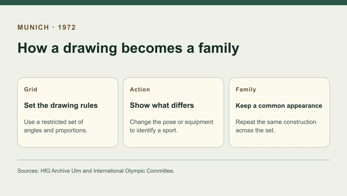
A reader needed to distinguish two Olympic sports from their pictograms and still recognise both images as part of the Munich Games. Otl Aicher’s design team used a shared drawing method to balance those requirements. The geometry disciplined the figures, leaving the particular action or equipment to carry the differences from one sport to another.
Compare the drawings
What stays constant across different sports
Read a symbol as two things at once: a member of the Munich set and an image of an activity.
| Feature | Shared rule | What can vary |
|---|---|---|
| Grid | An upright square with orthogonal and diagonal guides | Where a figure or piece of equipment sits in that field |
| Figure | Repeat a restrained construction for the body | The posture that describes the sporting action |
| Object | Use the same visual treatment | A specific implement or other equipment that makes a sport identifiable |
Chronology
A timeline of the turning points
Olympic hosts develop coordinated pictograms
Tokyo and other organisers establish the context for Munich’s visual project.
Aicher leads Munich design work
A design department undertakes a broader identity programme.
The rules become visible in use
Sport pictograms are applied alongside other elements of the event’s identity.
Who produced the system
The HfG Archive in Ulm identifies Aicher as responsible for the Munich Olympic design work from 1968. Research into the organising committee’s visual design department documents a team behind the finished work. This is important when separating leadership from drawing, testing and applying an identity. A design director can establish principles while many people translate them into the illustrations, typography and material seen throughout the Games.
A grid connects the pictures
The Olympic Studies Centre describes the underlying field as a square with orthogonal and diagonal guides. A controlled set of angles cuts down the number of different ways a line can bend or cross. That constraint helps figures from different sports look related. The designer can then change the pose, direction or equipment to suggest a particular event. Look for those changes first when trying to decide which action the image represents.
Pictograms within the larger Games identity
Munich’s public image also depended on colour, type and layouts. The pictograms had to function inside that larger system, where a visitor might see an image next to text or other guidance. Repeated construction makes the symbol family possible to recognise across settings. Tokyo’s earlier project shows the value of deploying pictograms widely, while Munich is especially useful for studying how a set of drawing rules can hold visibly different subjects together.
Continue the chronology
Related history guides
How Tokyo 1964 Made Olympic Pictograms a System
Read why Tokyo needed pictograms for both sport and general services.
Read the timeline1974–1979How the U.S. DOT and AIGA Developed Passenger Symbols
Compare an American project that brought common passenger symbols to different terminal settings.
Read the timelineConnected biographies
People connected to this history
Quick answers
Common questions
- What made the Munich 1972 pictograms look related?
- The figures used a common square drawing field and a controlled set of line angles.
- Was Otl Aicher the only designer involved?
- Aicher led the design work. Research on the organising committee identifies a visual design team delivering the larger project.
Primary and institutional sources
How this history was checked
Dates, legal milestones and historical claims are checked against the official and institutional records below. This article was reviewed on 19 November 2026.
- HfG Archive UlmThe bequest of Otl Aicher
- HfG Archive UlmOtl Aicher papers: collection finding aid
- International Olympic Committee50th anniversary of the Olympic Games Munich 1972
- Olympic Studies CentreDesign and identity of the Olympic Games
- Journal of Olympic HistoryThe learning of a new world: Olympic graphic designers